A Complete Guide to Survey Statistics: Methods, Examples, and Best Practices

Collecting survey responses is just the beginning. The real value comes when you analyze the data to understand trends, compare groups, and identify the insights that matter most. With the right tools and basic statistical methods, you can turn survey results into clear, actionable guidance for your business or research. In this guide, we’ll walk you through the top statistical techniques for making the most of your survey data.
The Prep Work That Makes Your Survey Statistics Reliable
Before jumping into graphs, charts, or complex statistics, it is important to make sure all the basics are in pace. The accuracy of your survey results depends just as much on preparation as on analysis. Here are a few things to sort out first before crunching on numbers.
Pick the Right People to Ask
Good data starts with the right group of people. Instead of trying to reach everyone, focus on selecting a survey sample that truly represents your audience. A well-balanced sample helps you capture opinions and behaviors that reflect the larger population. Sure, no sample is perfect, but if it’s chosen carefully, the difference between your sample results and the real-world picture (known as sampling error) will be minimal and acceptable.
There are a few ways to go about it. Random or probability sampling gives everyone an equal chance to be included, while non-probability sampling lets you focus on specific groups or characteristics. The best choice depends on what you’re trying to learn and how much time and budget you have.
Recommended read: Probability vs Non-Probability Sampling: A Complete Guide for Researchers
Decide What You Want to Prove (or Disprove)
Before analyzing survey statistics, be clear about what you want to prove or disprove. This means setting up two statements: a null hypothesis and an alternative hypothesis to guide your analysis.
For instance:
- Null hypothesis: There’s no connection between remote work flexibility and employee productivity.
- Alternative hypothesis: Employees with flexible work schedules are more productive.
Once you start analyzing the data, your goal is to see whether the evidence supports or challenges your initial assumption. This helps you stay objective and focused throughout the process.
Put Your Numbers in Perspective
Numbers don’t mean much on their own; context matters. That’s why benchmarking is essential before you interpret survey results.
Let’s say your customer service rating is 8.1 out of 10 this quarter. Is that impressive or below average? You can’t really tell until you compare it to a benchmark, maybe last quarter’s rating (7.5) or your industry’s average (8.3). Benchmarks help you see whether your results indicate progress, stagnation, or decline.
They also help account for outside factors like seasonality, market trends, or new competitors that might influence responses.
Decide How You’ll Summarize the Story
When you reach the analysis stage, think about how you want to explain your findings. Survey data can be explored in two main ways:
- Descriptive statistics: These summarize the basic features of your data, things like averages, percentages, or how responses are distributed. For example, “60% of respondents said they’d recommend our app to a friend.”
- Inferential statistics: These help you draw conclusions about a larger group based on your sample. For instance, using your survey of 500 customers to predict how your entire user base might feel about a new feature.
Descriptive stats help you understand what’s happening; inferential stats help you predict what’s likely to happen next. Together, they turn survey data into meaningful insights you can actually act on.
Types of statistical analysis methods
Survey data can be analyzed in many different ways, and the right method depends on your research objectives, the type of data you’ve collected, how it was gathered, the resources you have, and the tools you’re using to make sense of it.
Regression Analysis
Let’s start with a simple method: cause and effect. One thing changes. Another responds. That’s regression analysis in action.
It’s the technique that helps you see how different factors influence an outcome and even predict what might happen next. Think of it like connecting dots in your data.
Before we jump to an example, let’s understand two quick terms:
- Independent variables: The “inputs.” The factors you think might make a difference.
- Dependent variables: The “outputs.” What changes when your inputs do?\.
A small online bookstore wants to boost monthly sales. They try everything, running ads, sending newsletters, and offering discounts. But what’s actually working?
Here’s what they track:
- Dependent variable: Number of books sold online
- Independent variables: Social media ads, email newsletters, and special promotions
If they run a linear regression, they’ll test one factor at a time, say, do newsletters alone drive sales? If they run a multiple regression, they’ll see how all factors play together, ads, emails, promos, and which one carries the most weight.
Linear regression results are typically displayed as a graph, with the variables plotted on the axes and a “regression curve” illustrating the relationship between them. Since real-world data rarely follows a perfectly straight path, the curve often shows slight bends rather than a completely linear line.

T-Test
A T-test is a statistical method used to compare the averages of two groups to see if the difference between them is meaningful or just due to chance. It’s especially useful when the data comes from the same overall population but may have some variability you can’t predict.
Let’s break it down.
- Independent variable: Dichotomous — two categories, like morning vs. evening.
- Dependent variable: Interval — something measurable, like sales, scores, or tips.
Think of a café. The manager suspects morning customers are better tippers. So, they test it.
- Morning shift: $4.50 average tip
- Evening shift: $3.80 average tip
Looks like a difference, right? But the T-test cuts through the noise. It tells you whether that gap means something or if it’s just a coincidence.

Analysis of Variance (ANOVA)
Now, let’s raise the stakes. What if you’re comparing three or more groups? That’s where you can use ANOVA Analysis of Variance, ANOVA checks whether there are real differences between multiple groups or if they’re all basically the same.
There are two main types of ANOVA:
- One-way ANOVA: Compares the means of one independent variable across multiple groups to determine if there’s evidence that at least one group differs. A statistically significant result indicates that not all groups are equal.
- Two-way ANOVA: Expands on one-way ANOVA by examining the impact of two independent variables on a single continuous dependent variable.
Some quick facts:
- Independent variables: Nominal or ordinal
- Dependent variables: Interval
- Data display: Tables or bar graphs—clean visuals that tell the story fast
Now picture this: a software company runs three onboarding programs. They want to know which one keeps users happiest.
- Program A: 85% satisfied
- Program B: 78% satisfied
- Program C: 92% satisfied
Using ANOVA, they can answer the key question: Are these differences real, or just random variation? If the test confirms the differences are meaningful, the company can focus on improving the weaker programs while keeping the most successful one strong.
.avif)
Cluster Analysis
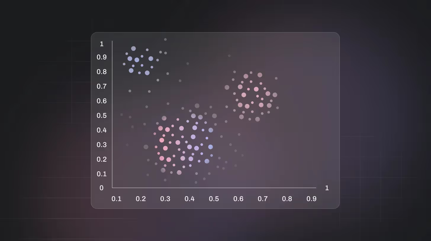
Ever notice how people naturally fall into groups even without trying? That’s what cluster analysis does. It finds patterns hiding in your data. Groups that make sense. Connections you didn’t even know existed.
Unlike methods that focus on cause and effect, cluster analysis just looks for similarities. It groups things that behave alike and keeps the outliers apart.
Perfect for market research, customer segmentation, or any project where you want to discover “who belongs where.”
- Levels of measurement: Interval
- Number of variables: Multivariate
For example, A music streaming service surveys thousands of users. They ask about genres, listening times, and devices. When they run cluster analysis, three distinct tribes appear:
- Heavy Streamers: Listen 3+ hours daily, mostly on smart speakers.
- Casual Listeners: 30–60 minutes a day, usually on mobile apps.
- Weekend Fans: Tune in mostly on weekends, using laptops or desktops.
Suddenly, the data isn’t just numbers. It’s people.
With this insight, the company tailors playlists, ads, and promotions for each group, boosting engagement and keeping everyone listening longer.
Factor Analysis
Now imagine you’re drowning in data, dozens of variables, endless survey questions. You need clarity. That’s where factor analysis steps in. It’s the art of simplification. This technique uncovers the core ideas hidden behind all that data noise.
Instead of looking at 20 separate questions, factor analysis reveals a handful of key themes, the “why” behind your numbers.
- Levels of measurement: Interval
- Number of variables: Multivariate
Let’s understand with an example: A fitness app surveys users about 15 aspects of its service, workouts, nutrition advice, customer support, usability, community features, you name it.
When they run factor analysis, the clutter clears. Everything boils down to three main forces:
- Engagement
- Ease of use
- Support quality
Suddenly, the team knows what really drives satisfaction. No more chasing every tiny metric. Just a clear focus on what matters most.
Conjoint Analysis
Conjoint analysis simulates real-world trade-offs to determine customer preferences.
Example: A restaurant tests menu options with different cuisine types, prices, and locations. Conjoint analysis can reveal that customers prioritize price and location over cuisine when choosing where to dine.

Crosstab Analysis
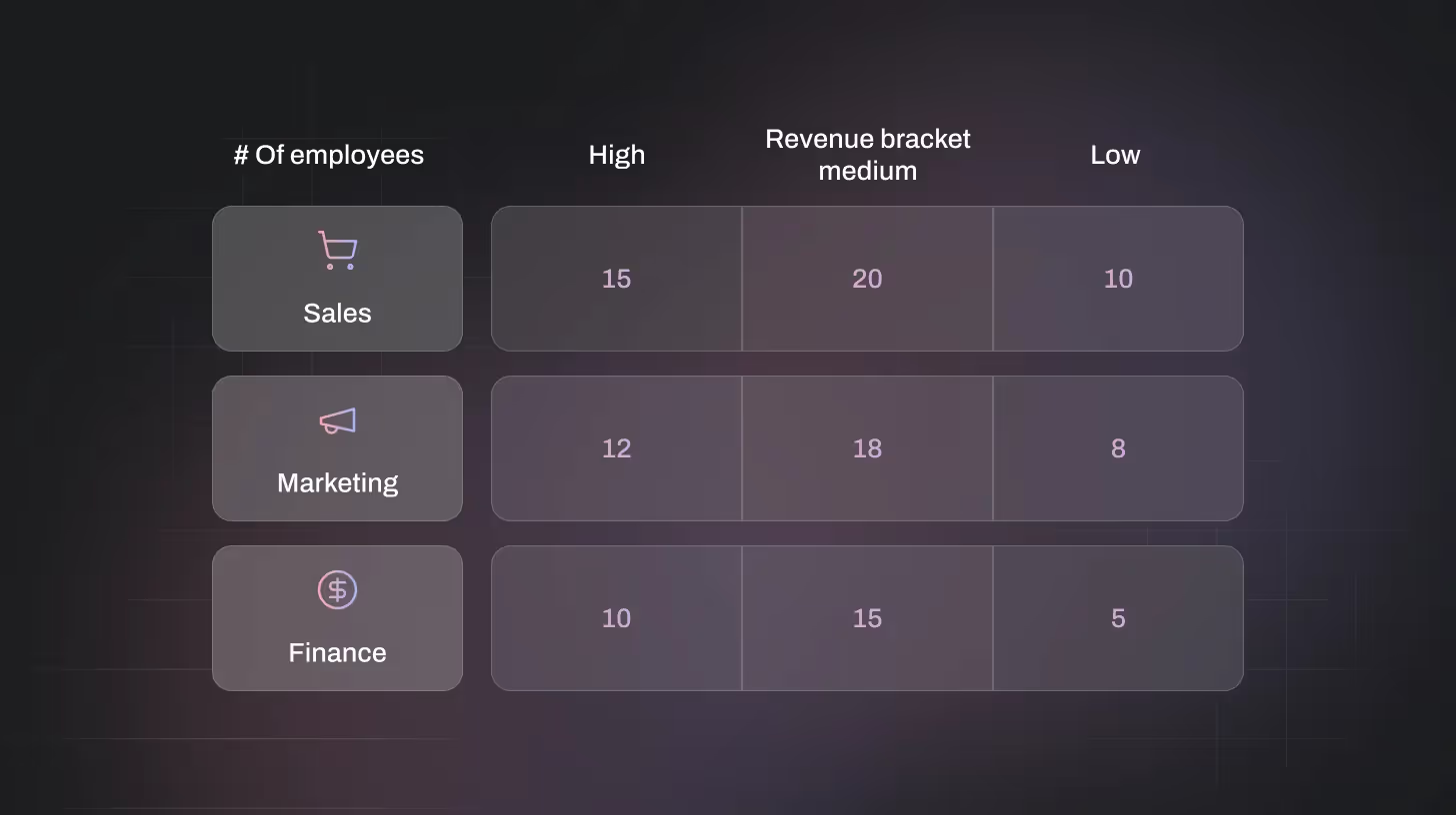
Crosstabs examine relationships between two categorical variables.
Example: A survey asks if people plan to buy a smartwatch (Yes/No) and their age group:
- Under 30: 65% Yes, 35% No
- 30–50: 50% Yes, 50% No
- Over 50: 25% Yes, 75% No
Crosstab analysis shows younger respondents are more likely to purchase, helping target marketing strategies.
Text & Sentiment Analysis
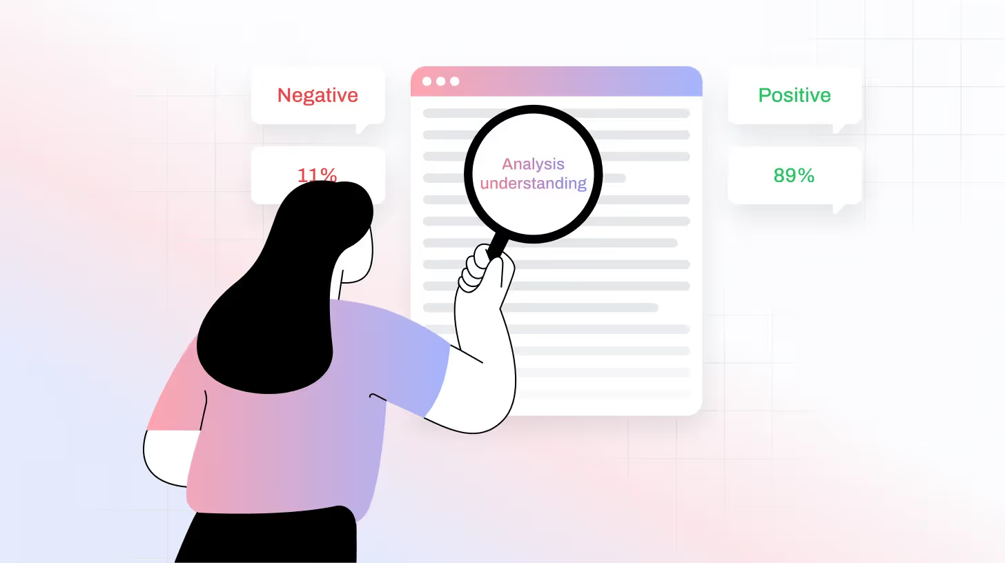
Text and sentiment analysis process open-ended feedback to identify common themes and emotional tone.
Example: A ride-sharing app collects 300 user reviews. Text analysis highlights “driver friendliness” and “app navigation” as key topics. Sentiment analysis shows driver friendliness has mostly positive sentiment, but app navigation is mostly negative, pinpointing areas for improvement.
Turn Survey Data into Actionable Insights with TheySaid
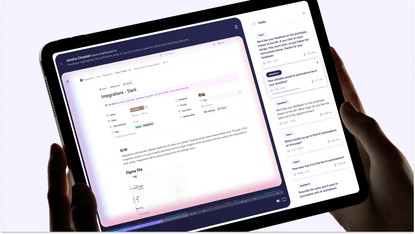
TheySaid is an all-in-one feedback platform that makes collecting and analyzing survey data effortless. It helps you design clear, targeted questions, run advanced statistical analyses, and visualize results instantly with charts and reports. With TheySaid, you can also set custom benchmarks and track trends over time, making it easy to uncover actionable insights and make data-driven decisions. Whether you’re measuring customer satisfaction, employee engagement, or market preferences, TheySaid simplifies the process, saving time while delivering accurate, meaningful results.
Key Takeaways
- Survey analysis starts before the numbers. Reliable insights depend on a solid foundation, clear goals, the right sample, and thoughtful question design.
- Context is everything. Benchmarks turn raw data into meaning by showing how your results compare to past performance or industry standards.
- Descriptive vs. inferential stats: Descriptive statistics summarize what happened; inferential statistics help predict what might happen next.
- Choose the right method for your goal:
- Regression Analysis: Reveals cause-and-effect relationships.
- T-Test & ANOVA : Compare groups to see if differences are statistically significant.
- Cluster & Factor Analysis: Simplify complex data by finding hidden patterns and themes.
- Conjoint & Crosstab Analysis: Understand preferences and relationships between variables.
- Text & Sentiment Analysis: Decode open-ended feedback to uncover what people really feel.
- Action beats observation. The goal of survey statistics isn’t just to analyze—it’s to identify insights you can act on to improve customer experience, product decisions, or business performance.
- Tools like TheySaid make advanced analysis accessible with built-in visualization, benchmarking, and automation, helping teams turn feedback into measurable outcomes faster.
FAQs
How can I make my survey results statistically reliable?
Focus on sampling, question design, and consistency. Choose a representative sample, use unbiased wording, and collect enough responses to minimize error. Setting benchmarks and repeating surveys over time also improves reliability and accuracy.
How do I test if survey results are statistically significant?
You can run a T-test (to compare two groups) or ANOVA (for three or more groups). These tests show whether differences in your survey data are real or just random chance — usually based on a p-value of less than 0.05 to indicate significance.
How does text or sentiment analysis help interpret survey feedback?
Text and sentiment analysis automatically review open-ended responses to find common themes and emotional tone. For instance, it can highlight positive mentions of “customer support” or negative ones about “pricing,” helping you pinpoint what drives satisfaction or frustration.






.svg)


